Your Portfolio Is a Product. Most Engineers Treat It Like a File.
Most developer portfolios look like they were built on a Sunday afternoon, uploaded to GitHub Pages, and abandoned sometime around the third beer.
You know the ones. Static HTML. Inline styles. A JPEG of the developer squinting professionally into a camera. A “Contact Me” section with a Mailto link that goes to a Gmail account they check twice a month.
I’ve maintained versions of this for years. It embarrassed me a little every time I shared it, but never quite enough to rebuild it. The activation energy was always too high.
Then I started building AI systems professionally, writing about them publicly, and taking on advisory work and speaking engagements. And suddenly the portfolio wasn’t an afterthought. It was the first thing people checked. Check mine here.
So I rebuilt it. Properly. And along the way I made a bunch of deliberate tech choices that I think are worth explaining, because they’re the same choices you’d make if you were building any modern, production-grade web product.
Not because you want to show off a portfolio. But because the principles transfer.
What the Stack Actually Is
Before getting into the why, here’s the what:
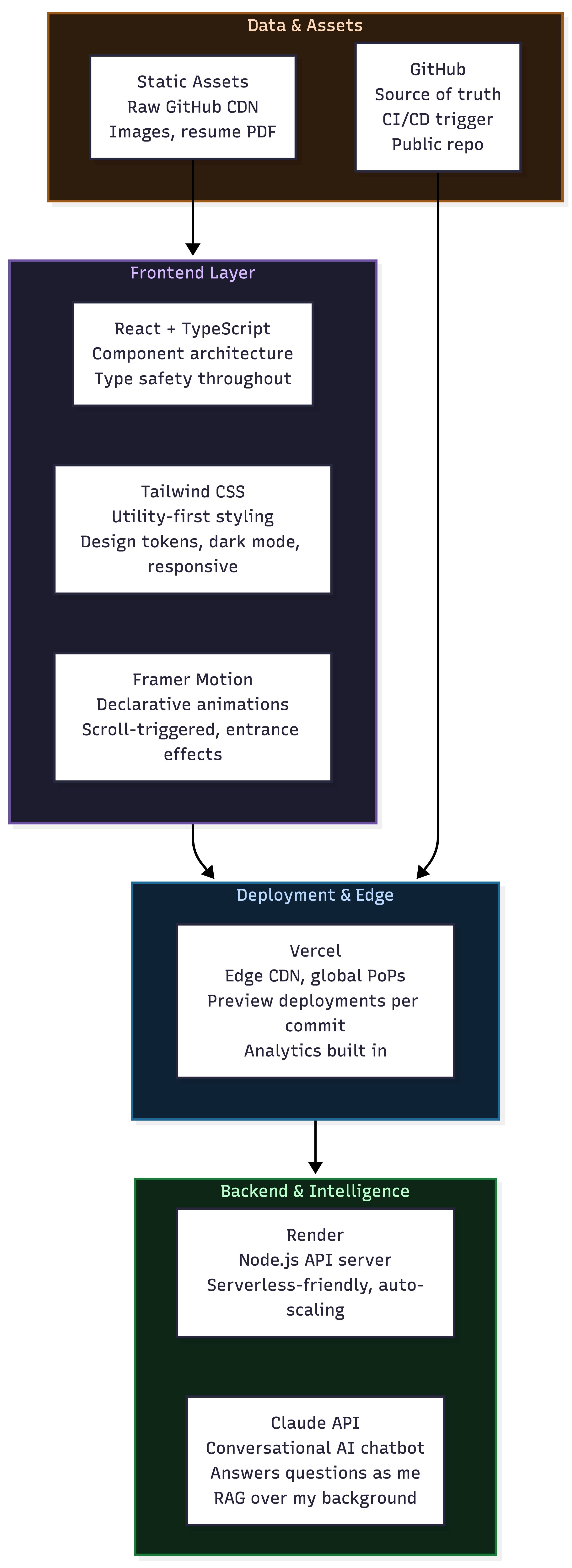
Let me go through each decision and tell you the actual reasoning, not the version where every choice was obvious and correct from the start.
Vercel: The Invisible Infrastructure Win
I’ll start with the one that has the most transferable lesson.
The naive approach to deploying a frontend project is: build it, upload the files somewhere, point a domain at it. GitHub Pages does this. Netlify does a slightly fancier version. It works.
Vercel does something structurally different. When you push to your repository, Vercel doesn’t just redeploy your site. It:
Builds and deploys to a global edge network (not one server, everywhere)
Creates a unique preview URL for every single commit and pull request
Runs your build in a clean environment to catch “works on my machine” failures
Serves assets from the CDN node geographically closest to each visitor
Gives you real analytics: Core Web Vitals, geographic breakdown, load times, without installing anything
The preview deployment thing sounds like a minor convenience. It isn’t. It means that before I merge any change, I can share a live, publicly accessible preview of exactly what it’ll look like. Not a screenshot. Not a localhost URL. An actual deployed version of the change.
That’s a workflow pattern borrowed from production engineering at scale. It’s the same reason companies like Vercel, Netlify, and Cloudflare Pages exist: because the gap between “works locally” and “works for everyone globally” used to require significant DevOps infrastructure. Now it’s zero config.
For a personal project, this might seem like overkill. But if you ever build a product that needs to load fast for users in Bangalore, São Paulo, and Oslo simultaneously, the architectural habit of thinking in edge networks rather than single-server deployments is worth building early.
Tailwind CSS: Designing at the Speed of Thought
Here’s an opinion that will get me some strongly worded replies: Tailwind CSS is not for people who can’t write CSS. It’s for people who’ve written enough CSS to know how bad it gets at scale.
Traditional CSS (or even SCSS) has a fundamental organizational problem. You write styles in one place, apply them in another, and over time the connection between the two becomes archaeology. You don’t delete old styles because you’re not sure what’s using them. You add new styles that duplicate old ones because searching is slower than writing. You end up with a stylesheet that’s half legacy, half contradiction.
Tailwind solves this with a constraint that feels annoying at first: you write your styles directly in your HTML as utility classes. flex items-center justify-between gap-4 px-6 py-3 bg-slate-900 rounded-xl hover:bg-slate-800 transition-colors.
The result: your styles and your structure live together. You can read a component and know exactly what it looks like. You can delete a component and know that all its styles went with it. You can open a component you haven’t touched in six months and understand it immediately.
The other thing Tailwind does is enforce design consistency through its token system. Colors, spacing, typography, border radius, shadow levels: all defined in a config file that becomes the single source of truth for your visual design. text-slate-400 is always the same color. p-6 is always the same padding. You can’t accidentally use a slightly different shade of gray in component number 47 because you were tired.
For a portfolio, this means the whole thing looks coherent without a designer. For a product team, it means designers and engineers share a vocabulary and the gap between “what’s in Figma” and “what’s in code” actually closes.
Framer Motion: Animation as Communication
This is the one people ask about most when they see the portfolio. The smooth entrances, the scroll-triggered reveals, the way sections appear to have weight.
The temptation with animation is to use it decoratively. To make things spin because spinning is possible. This is how you end up with a portfolio that feels like a loading screen that never finishes.
The discipline that Framer Motion enforces (or rather, that you have to enforce when using it) is treating animation as information. An element fading in as you scroll to it tells you: this section exists independently. A button that scales slightly on hover tells you: this is interactive. A card that lifts with a shadow on hover tells you: you can click this.
Animation answers the question “what is this thing?” before you read it. Good animation reduces cognitive load. Bad animation adds it.
Framer Motion makes the right patterns easy: initial, animate, whileInView. Declare where an element starts, where it ends, and optionally what happens when it enters the viewport. The library handles the browser physics. You handle the intent.
// This is all it takes for a smooth scroll-triggered entrance
<motion.div
  initial={{ opacity: 0, y: 30 }}
  whileInView={{ opacity: 1, y: 0 }}
  transition={{ duration: 0.5, ease: "easeOut" }}
  viewport={{ once: true }}
>
  Your content here
</motion.div>
Thirty lines of boilerplate in vanilla CSS. Three lines of intent in Framer Motion.
Render for the Backend: The “Just Works” Tier
The portfolio has a conversational AI chatbot that answers questions about my background as if it were me. This requires a backend: an API server that handles the conversation, manages context, calls Claude, and returns structured responses.
Render is where that lives.
Here’s the honest case for Render over the alternatives: AWS gives you infinite control and infinite ways to misconfigure something at 2am before a job interview. Heroku was perfect until the free tier died and pricing became unpredictable. Render sits in the gap: real infrastructure, sane pricing, zero-config deployments from GitHub, auto-scaling when traffic spikes, sleep-to-zero when it doesn’t.
For a backend that serves maybe a few dozen requests a day, most serverless options are genuinely overkill. Render’s free/starter tier handles it, scales when needed, and never requires you to think about load balancers, EC2 instance types, or VPC configuration.
The broader lesson: the right infrastructure is the least infrastructure that solves the problem reliably. Over-engineering your hosting is a real failure mode, especially when you’re also trying to ship the actual product.
The AI Chatbot: The Part That Actually Took Time
The bit that surprises people most about the portfolio is the chatbot. You can open it and ask “How did Hardik reduce Paytm’s payment SLA from 15 to 3 days?” and get a specific, accurate answer. Not a canned response. An answer that draws from my actual background.
This is RAG in its simplest useful form. The Claude API is given my full professional background as structured context, plus a system prompt that instructs it to answer as me, with my communication style, not as a generic AI assistant. The conversation history is maintained client-side and sent with each request so context compounds across the conversation.
Is this complex? No. That’s the point. The most useful AI features in products are often the ones that are architecturally simple but experientially powerful. A well-scoped system prompt, good context, and a capable model is most of what you need for a surprisingly high percentage of real use cases.
People ask me about it. Not because it’s technically impressive. Because it’s immediately, obviously useful. That’s the bar.
The Design Philosophy (Or: Why It Doesn’t Look Like a Template)
There’s a graveyard of portfolio templates that all look exactly the same. Dark background. Gradient text on the hero. Floating blobs. A “Tech Stack” section with icon grids. A contact section that goes nowhere.
The goal here was different: minimal enough to not distract, dense enough to communicate serious work. Dark mode because this is primarily viewed by people who have been staring at screens all day. Motion that earns its presence. Typography that’s easy to scan. Data that speaks for itself (£3.5B platform, 15-day to 3-day SLA, 40% attrition reduction) without needing a copywriter to frame it.
One decision I’d make differently: a proper blog section that renders my Substack and Medium posts directly, rather than linking out. Keeping readers on the domain is better for SEO and better for the reader experience. That’s next. (Or by the time you read this, it might have been done already :) )
What This Is Actually About
Here’s the honest version of why I wrote this.
Your portfolio is the first thing people check. Not your LinkedIn. Not your GitHub. The thing that shows up when someone Googles your name after a referral, before an interview, after a talk.
Most engineers treat it as a checkbox. Get it done once. Move on. And then they wonder why their resume isn’t converting, why they’re not getting inbound, why nobody remembers them after a conference.
The tech choices in this portfolio aren’t arbitrary. Vercel gives you the deployment workflow of a serious engineering team. Tailwind gives you design consistency without a designer. Framer Motion gives you motion that communicates rather than decorates. Render gives you real backend infrastructure without real backend complexity. Claude gives you a conversational interface that makes your experience tangible rather than just listed.
None of these are new technologies. All of them are deliberate choices with real tradeoffs. And the discipline of making deliberate choices with real tradeoffs is exactly the thing that separates engineers who build maintainable systems from engineers who build things that work once and then become someone else’s problem.
Build it properly. It’s the one thing on the internet that’s entirely yours.
-Hardik
Curious about any specific component? The full portfolio is at hardik-portfolio-rho.vercel.app. The chatbot will answer almost anything you throw at it.
Data & AI Architect. Writes about AI systems, engineering infrastructure, and the practical decisions that separate production from prototype.